In a lecture at the University of Pennsylvania in 1973, Thomas J. Watson Jr., the former IBM boss, coined this remarkable phrase: good design is good business. Your design – it can be of anything in any line of business, proportionally equates to the impact you make in your niche field. We have kept that nugget of wisdom on the mind and done the same thing to change the look and feel of LearnerScript’s website.
Now, we revamped the site totally accordingly.
As a result, you see a brand-new website for LearnerScript, with light hues of Navy Blue on Creamy White background. This time we moved away from the all-in-one-page site to multiple pages one. Accordingly, you see the extended coverage on the tool’s features and how they are solutions for the problems you are having now in obtaining Moodle learning analytics.
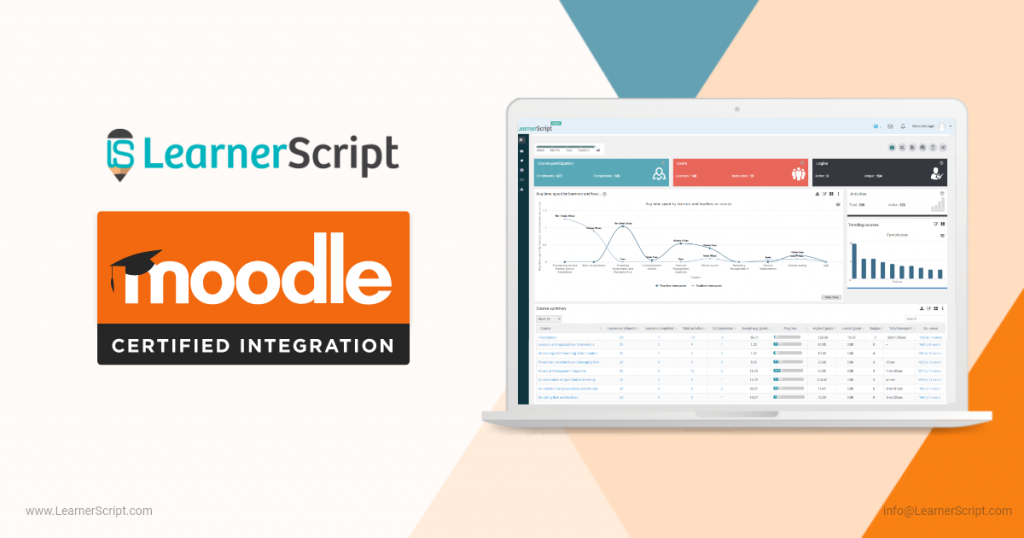
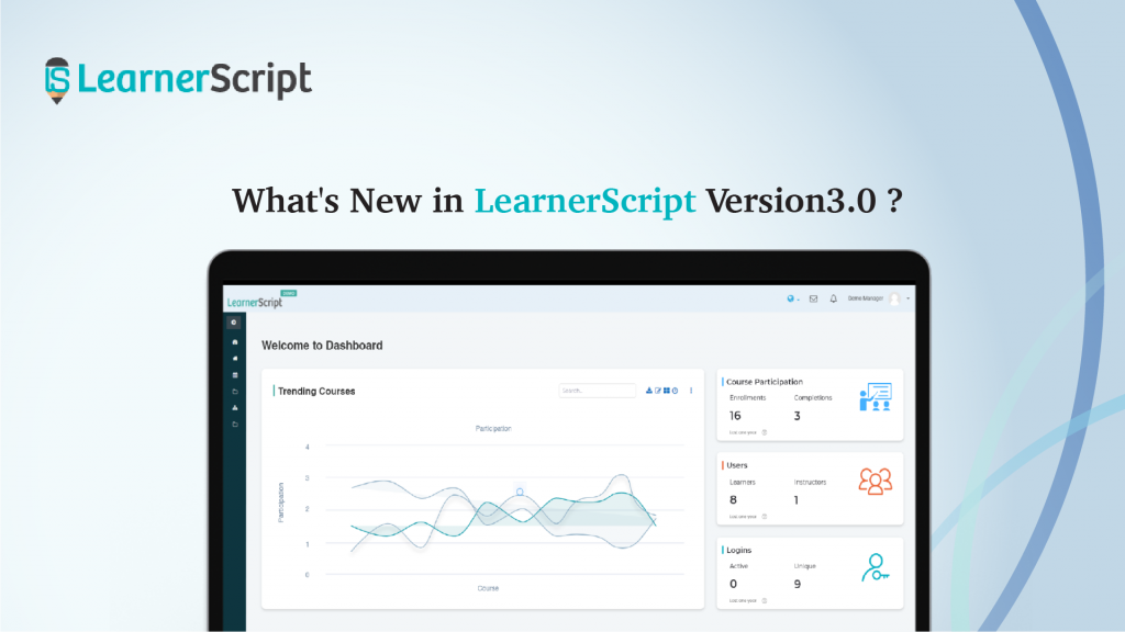
Aesthetically, the 3D images look way better than realistic images and routine slide shows. Further, placing enhanced reporting images are making the site animated and appealing to the visitors.
One new addition to this new website is Partner. Within six months of its launch, LearnerScript has made partnership deal with Brazilian Edu-tech company, Sofia. The Brasilia based company is our first partner and is an exclusive partner for entire Brazil in South America. From now onward, you can search for our partners here.
When we look back it’s really inspiring. When we launched LearnerScript six months ago, we simply made an all-in-one-page website. If we borrow words of Eric Ries, the Lean Startup guy, this is what we can say – we’ve made a Minimum Viable Website. For whosoever visited it, the site was there to inform about the Moodle plugin, with so much more to improve and convey for the visitors.
Now we’ve done and dusted it


